Far sight & reception
Like a satellite dish on a mountain. Always ready to receive signals, to scan new technologies and to send information out into the world.
Archive · From the former website · Logo story
…and sometimes it all begins with a smile and a question: “What does that actually mean?” The story behind my logo — six readings, one homage, and the values behind them.
 AuthorMatthias EgerCertified Manager for Applied AI Transformation (IHK)
The mark
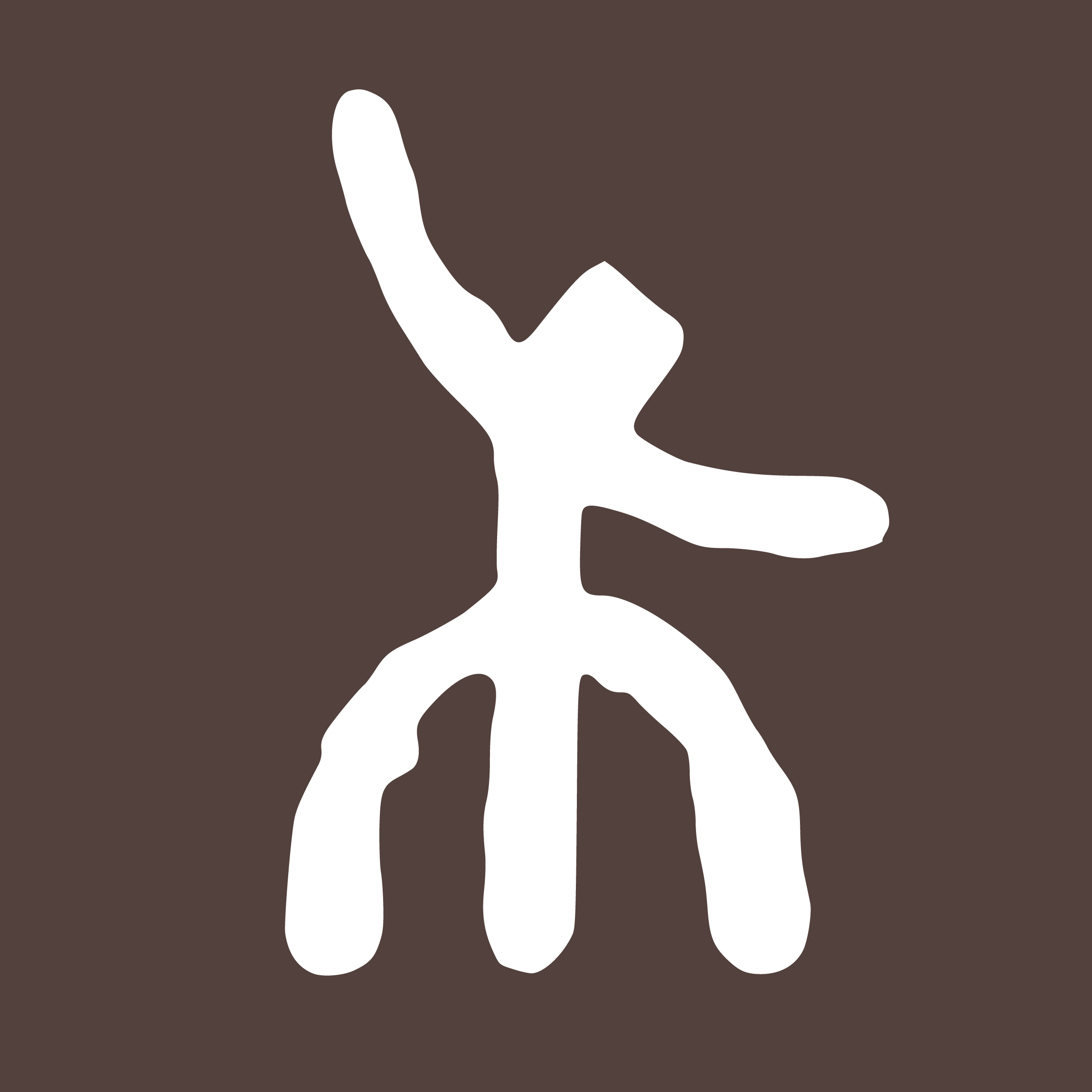
A logo is often just a graphic. To me it is an anchor — and a way to start a conversation. Hardly any mark has earned me as many questions as this one.
The mark does not explain itself. Whoever asks gets six answers: five serious ones and one with a wink.
Like a satellite dish on a mountain. Always ready to receive signals, to scan new technologies and to send information out into the world.
A dot in the middle that connects everything. The goal firmly in view, without losing sight of what surrounds it. Being centred in a chaotic world.
A person with open arms. Friendly, welcoming and ready to work together. Technology is good — but people come first.
A flower with roots. It runs photosynthesis — turning light (ideas) into energy (results). Rooted in the soil, yet growing towards the sun.
“Is that some kind of kanji?” — a kind Japanese lady once asked me. Perhaps. It stands for aesthetics, clarity and a universal language that needs no words.
A man with a — well — “third leg to stand on”. The wink belongs to it: a symbol of absolute stability, humour and an immovable standpoint.
When I was looking for a symbol to represent my identity and my work, I did not want an empty shell. I was looking for something that carries my deepest values: openness, constancy, robustness and adaptability.
Let me use this place to thank an artist who shaped my visual compass more than anyone else: Vlad Gerasimov (vlad.studio). His art — surreal, warm, connecting and yet so wonderfully simple — has always been a retreat and a source of inspiration for me. This logo is my small tip of the hat to his work, which showed me that digital art can have a soul.
I stand by my values — friendliness, honesty, directness and humour. But I also want to be honest: defending those values was not always easy. My path came with tears, depression and hard lessons. The pandemic years in particular put every one of us to the test. A lot broke apart — structures, certainties, relationships.
Yet among the shards there was an insight too: life means change. Whoever stays rigid breaks. Whoever stays open to the world grows. I have learned that we, as people and as companies, have a duty to deliver real value — for the world, for other people and for animals.
“In the end, money is only printed paper. It loses all meaning if you have no real connections and no memories.”
The most valuable thing we own is our lifetime. We pay with it every single day. And the only fair trade for that time are connections that last and memories that keep you warm.
Who stands behind the logo — today with an audit trail instead of self-assessment.